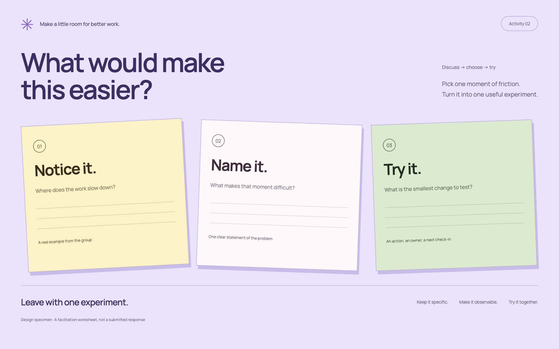
When this fits
Use this system for workshops, training, retrospectives, and collaborative planning. Design for participant action and facilitator clarity rather than a continuous stream of presentation claims.
Composition
Give each activity a purpose, instructions, expected output, and a clear completion condition. Add a timebox only when it comes from the plan or is explicitly proposed as adjustable. Keep facilitator notes separate from participant-facing instructions.
Typography
Use 36–48pt titles and 24–30pt instructions for a projected deck. Worksheets need enough writing space at their actual print or screen size. Keep exercise labels short and the action verb easy to find.
Components and meaning
Use a restrained set of warm surfaces to group activities. Notes, examples, and blank output regions must look different. Do not fill an exercise with decorative notes that could be mistaken for participant responses.
Interaction details
Alternate explanation, example, activity, and reflection according to the session. Use repeated activity frames when familiarity helps, but vary the composition when the task changes. A discussion prompt and a comparison worksheet should not look identical.
Responsive and output behavior
For editable slide files, keep text boxes, activity regions, and diagrams editable. For an interactive canvas, use actual controls and persistent data only when implemented. Do not make a static slide look like a working submission form.
Motion and difficult states
Verify projected readability, print contrast, writing space, and the handoff between slides. Check that every exercise has enough context to be understood when exported or shared without the facilitator.
Visual signature
Use a welcoming pastel work surface with visibly different activity-paper regions. The specimen uses a rounded sans-serif, 25px HTML specimen body text, 48px controls where relevant, and 12px activity-region corners. Numbered activities provide order; connectors must not cross instructions or writing areas. Keep blank response space intentional and distinguish it from a loading placeholder.
Apply the system
Read the existing project design instructions and the actual target screen before editing. Treat tokens.css as a starting vocabulary; map it into existing semantic tokens rather than adding a competing theme. Follow the user’s chosen palette, platform, and framework when they differ from this example. Do not change business logic, authentication, navigation destinations, or data behavior merely to reproduce the preview.
Open preview.html to inspect the system’s composition and component relationships. The preview is a visual specimen with sample content, not a complete application. Adapt the relationships to the user’s real content rather than copying its sample records.
Verify the result
Inspect the real output at its intended size and at a narrow viewport where applicable. Check text wrapping, alignment, contrast, focus, hover, selected, disabled, loading, empty, and error states. Exercise the primary action and its return path. For slide files, inspect every exported page and preserve editability. Report what was changed and actually verified; do not claim a visual preview proves a working backend.
Dropdown controls
Use styled, accessible dropdown menus that belong to the chosen design system. Style the opened option list as well as the trigger; do not expose an OS-native select popup. Include a selection checkmark, hover/focus/disabled states, arrow-key navigation, typeahead, Escape/outside dismissal, and viewport-bounded positioning. Reuse the project’s accessible select primitive. Preserve labels, values, form validation, reset behavior, and change events. For a small fixed quantity, a labeled radio group or stepper can be clearer than a dropdown.