When this fits
Use this system for proposals, product stories, fundraising narratives, and presentations with a clear ask. Start from the audience’s decision and the evidence available. Do not force every story into the same number of slides.
Composition
Give the deck an explicit sequence: context, problem or opportunity, proposed approach, proof, and next decision. A slide should have one main claim. Split two unrelated claims into separate slides rather than reducing everything to small text.
Typography
For a 16:9 deck, start around 40–56pt titles, 24–30pt body text, and 16–18pt source notes. Adjust for the actual viewing distance and output format. Use short readable lines and consistent alignment rails. Never shrink body text merely to fit a paragraph.
Components and meaning
Alternate claim-led slides, visual explanations, comparisons, and evidence pages according to the narrative. A full-screen image needs a reason to be there. Use one strong accent on dark ink or a light alternative when the destination requires printing.
Interaction details
Keep charts tied to supplied data and identify assumptions. Preserve units, dates, and sources. Avoid fabricated market sizes, customer quotes, logos, or traction. An empty evidence slot is a request for evidence, not permission to invent it.
Responsive and output behavior
When producing an editable presentation, keep text, shapes, and charts editable where the format supports them. Do not flatten every slide into a screenshot. Put supporting detail in notes or an appendix when that serves the audience.
Motion and difficult states
Use consistent margins and modest transitions when playback supports them. The exported static deck must remain complete without motion. Check every slide at normal presentation scale, inspect clipping and text overflow, and confirm that the closing ask is specific.
Visual signature
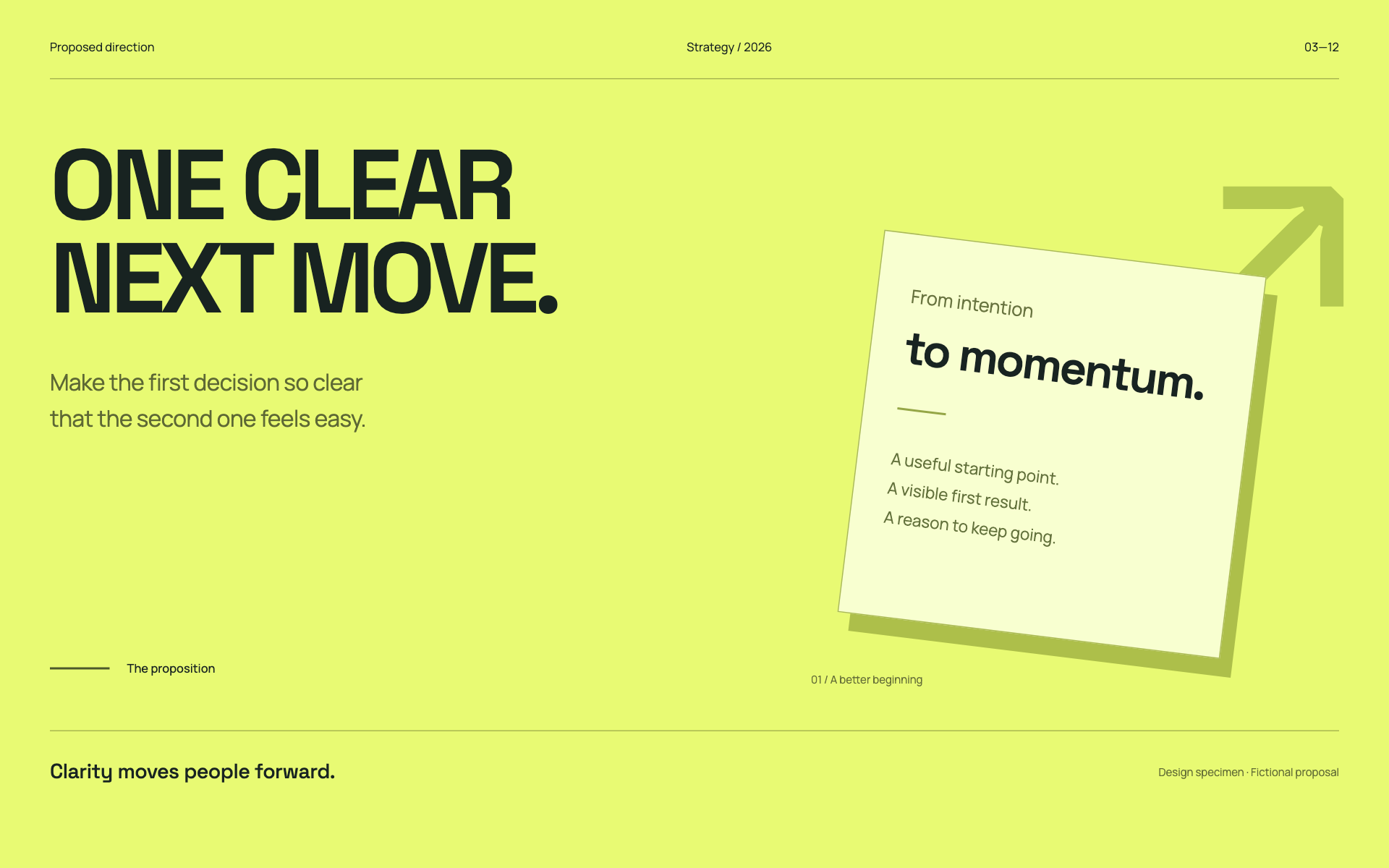
Use a poster-scale statement, a sharply limited message count, and a strong contrast between the claim and its supporting visual. The specimen uses a bright acid-paper canvas, geometric display type, 26px HTML specimen body text, and square framing. Translate these relationships into appropriate point sizes when creating editable slides. Vary claim, proof, and closing slides according to the story; a single split layout is not a deck system.
Apply the system
Read the existing project design instructions and the actual target screen before editing. Treat tokens.css as a starting vocabulary; map it into existing semantic tokens rather than adding a competing theme. Follow the user’s chosen palette, platform, and framework when they differ from this example. Do not change business logic, authentication, navigation destinations, or data behavior merely to reproduce the preview.
Open preview.html to inspect the system’s composition and component relationships. The preview is a visual specimen with sample content, not a complete application. Adapt the relationships to the user’s real content rather than copying its sample records.
Verify the result
Inspect the real output at its intended size and at a narrow viewport where applicable. Check text wrapping, alignment, contrast, focus, hover, selected, disabled, loading, empty, and error states. Exercise the primary action and its return path. For slide files, inspect every exported page and preserve editability. Report what was changed and actually verified; do not claim a visual preview proves a working backend.
Dropdown controls
Use styled, accessible dropdown menus that belong to the chosen design system. Style the opened option list as well as the trigger; do not expose an OS-native select popup. Include a selection checkmark, hover/focus/disabled states, arrow-key navigation, typeahead, Escape/outside dismissal, and viewport-bounded positioning. Reuse the project’s accessible select primitive. Preserve labels, values, form validation, reset behavior, and change events. For a small fixed quantity, a labeled radio group or stepper can be clearer than a dropdown.