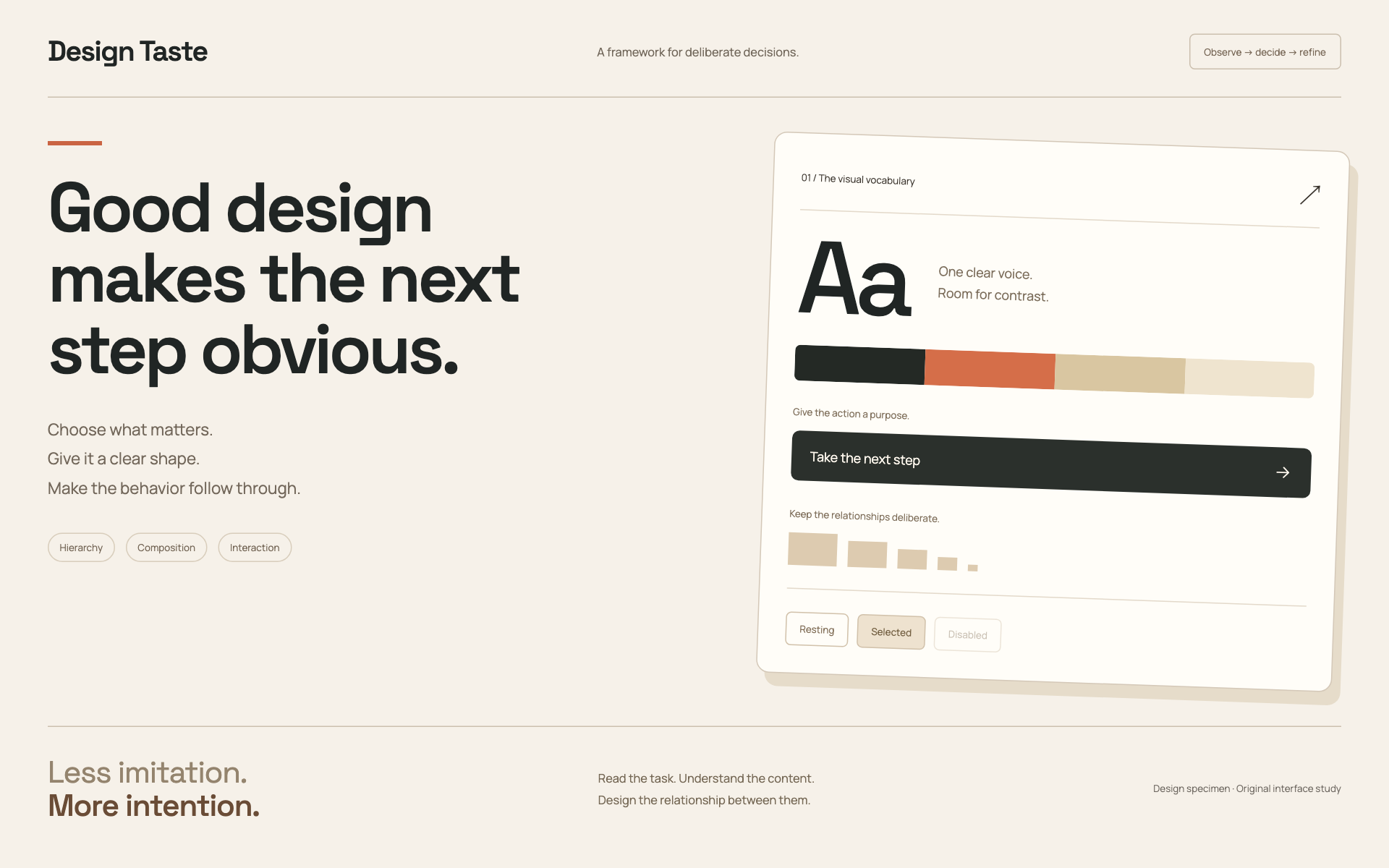
Make the output feel deliberately designed around its content and purpose. The goal is a coherent result that helps someone understand, decide, or act. A recognizable visual style is useful only when it serves that task.
Begin with the actual case
Read the user’s brief, existing design instructions, and the relevant current screen or artifact. Identify the audience, primary task, output format, real content, and constraints that change design decisions. Preserve the user’s chosen brand and platform. For an existing product, inspect the current flow and shared components before introducing new patterns.
Separate a composition problem from a missing feature. A button that leads back to information already visible is a flow problem; a new radius will not fix it. A blurry product image is an asset or rendering problem; adding a shadow will not restore detail. A crowded form needs prioritization and grouping before a palette change.
Choose one direction
If the user supplies a design system, use it. Otherwise, use the selection guide to choose a direction based on the content and task. State the choice briefly, then work. Ask a question only when competing interpretations would materially change the result.
Define a small working vocabulary: surfaces, text and status colors, display and body typography, a spacing rhythm, content rails, control dimensions, and state treatments. Reuse the project’s semantic tokens and primitives. Map a supplied token file into that vocabulary rather than maintaining two competing theme systems.
Names should describe the visual qualities or use case. Do not name a system after a company, imply affiliation, or copy a product’s identity. Translate an admired reference into general principles such as density, alignment, hierarchy, or interaction behavior.
Compose around meaning
Establish what the viewer should notice first, what supports it, and what they can do next. Give these different visual weights. Use the fewest containment layers that explain the relationships: whitespace, alignment, and a divider often suffice. Reserve a card for a meaningful unit, not every paragraph.
Set reading measures and line breaks using the actual copy. Headings should wrap naturally across realistic widths. Do not rescue a weak layout by shrinking text until it fits. Keep navigation, content, and controls on deliberate alignment rails; account for a button’s internal text inset when a secondary action is visually grouped beneath it.
Let imagery earn its space. Use relevant supplied assets, original permitted material, or a clear typographic composition. Do not fabricate social proof, statistics, sources, or product behavior. Use an image at the density needed for its display size; do not enlarge a thumbnail and call it a hero.
Make interaction part of the design
Implement focus, hover, selected, pressed, disabled, loading, empty, success, and error states where they exist in the product. Keep the state’s meaning clear without color alone. Labels describe the action or destination. A primary CTA needs a concrete next step and a coherent return path through sign-in or a modal.
Use the platform’s established interaction patterns. Preserve keyboard access, touch targets, safe areas, and readable text scaling. Overlays should have an appropriate close mechanism and restore a usable focus position. Do not change authorization, data handling, or business rules merely to satisfy a visual specimen.
Motion should explain a state change or a relationship. Keep it brief and controllable, respect reduced motion, and preserve a complete static state. For a deck, the exported slides must work without animation. For a product film, verify the encoded artifact as well as the composition source.
Visual signature
When creating a library or several concepts, compare them without their names. A new palette on the same layout is not a new design direction. Deliberately vary dominant region, density, type family, scale relationships, component construction, imagery, and the way a task progresses. Keep a consistent outer library interface while allowing the specimens themselves to be distinct. Shared resets and accessibility primitives are useful; a shared composition forced onto every format is not.
Inspect and improve
Render the real deliverable. Inspect the initial view, the main action, and the states most likely to break its hierarchy: long content, missing media, narrow screens, open menus, empty data, and failures. Check for duplicate dividers, clipped controls, competing primary actions, illegible metadata, and accidental mixed typography.
Fix the cause with the smallest coherent change, then recheck the affected flow. Preserve accepted decisions when the user steers another part of the work. In the handoff, distinguish what was implemented, visually inspected, functionally tested, and still missing. Do not claim that a polished preview proves a complete application.
Dropdown controls
Use styled, accessible dropdown menus that belong to the chosen design system. Style the opened option list as well as the trigger; do not expose an OS-native select popup. Include a selection checkmark, hover/focus/disabled states, arrow-key navigation, typeahead, Escape/outside dismissal, and viewport-bounded positioning. Reuse the project’s accessible select primitive. Preserve labels, values, form validation, reset behavior, and change events. For a small fixed quantity, a labeled radio group or stepper can be clearer than a dropdown.