When this fits
Use this system for research readouts, operating reviews, policy briefs, and decisions that depend on evidence. The audience should be able to separate observation, interpretation, and recommendation.
Composition
Lead each slide with its finding, then show the evidence that supports it. Group related comparisons into a shared frame. Reserve a consistent region for units, definitions, caveats, and sources so these do not compete with the primary message.
Typography
Use 32–44pt titles, 22–28pt body text, and readable source notes. Tables may be denser when the viewing context permits it, but critical findings must remain readable from the presentation distance. Use tabular numbers for comparisons.
Components and meaning
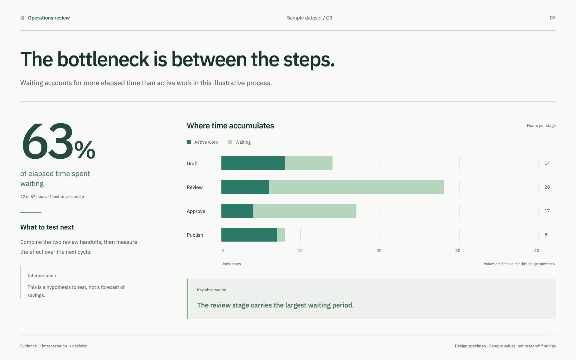
Choose charts based on the question: change over time, distribution, composition, or comparison. Label axes and units directly. Keep scales comparable when presenting a comparison and explain any truncated axis. Do not decorate a chart with unrelated perspective or area effects.
Interaction details
Keep series colors stable throughout the deck. Use emphasis for the finding being discussed, while preserving enough context to judge it. Distinguish missing data, zero, projections, and uncertainty. Any confidence interval or forecast must come from the source or an explained method.
Responsive and output behavior
Keep outputs editable when generating a presentation file. Record sources alongside the material they support. A static export must retain the meaning of annotations and highlights without relying on presenter narration.
Motion and difficult states
Verify calculations against the supplied data, inspect labels and collisions, and check the exported deck page by page. Review whether the recommendation follows from the evidence rather than from the strongest-looking visual.
Visual signature
Use a restrained briefing grid with a clear finding, a directly labeled chart, and a visible interpretation/source region. The specimen uses a sturdy sans-serif, 23px HTML specimen base text, 40px controls where needed, and square analytical framing. Highlight one observation at a time. Keep bar lengths, totals, percentages, units, and any rounding mutually consistent even in sample data.
Apply the system
Read the existing project design instructions and the actual target screen before editing. Treat tokens.css as a starting vocabulary; map it into existing semantic tokens rather than adding a competing theme. Follow the user’s chosen palette, platform, and framework when they differ from this example. Do not change business logic, authentication, navigation destinations, or data behavior merely to reproduce the preview.
Open preview.html to inspect the system’s composition and component relationships. The preview is a visual specimen with sample content, not a complete application. Adapt the relationships to the user’s real content rather than copying its sample records.
Verify the result
Inspect the real output at its intended size and at a narrow viewport where applicable. Check text wrapping, alignment, contrast, focus, hover, selected, disabled, loading, empty, and error states. Exercise the primary action and its return path. For slide files, inspect every exported page and preserve editability. Report what was changed and actually verified; do not claim a visual preview proves a working backend.
Dropdown controls
Use styled, accessible dropdown menus that belong to the chosen design system. Style the opened option list as well as the trigger; do not expose an OS-native select popup. Include a selection checkmark, hover/focus/disabled states, arrow-key navigation, typeahead, Escape/outside dismissal, and viewport-bounded positioning. Reuse the project’s accessible select primitive. Preserve labels, values, form validation, reset behavior, and change events. For a small fixed quantity, a labeled radio group or stepper can be clearer than a dropdown.