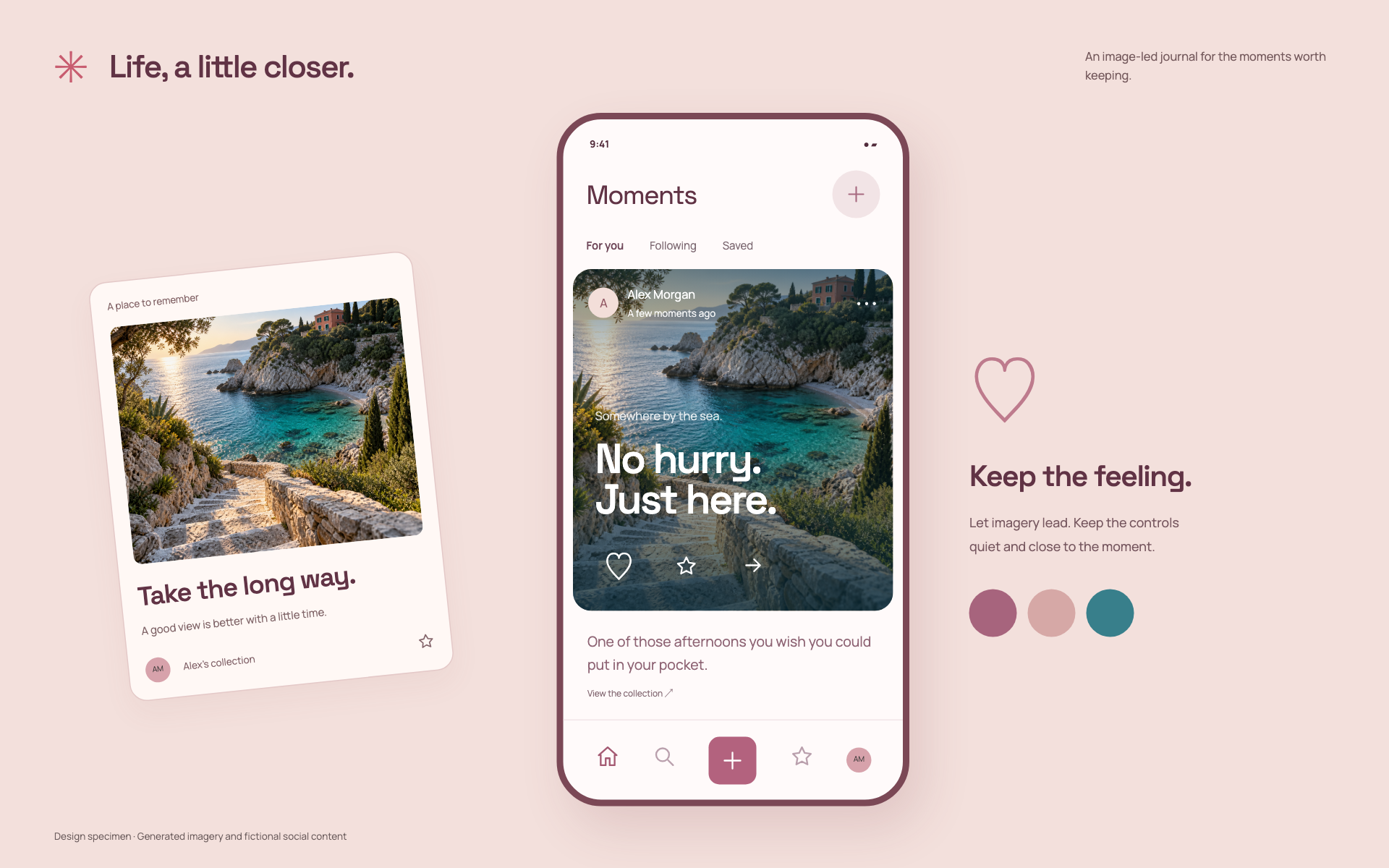
When this fits
Use this system for communities, personal collections, shared journals, and content-led mobile apps. The person, the content, and the next action should remain distinguishable.
Composition
Use a stable feed rhythm with a recognizable author region, media region, caption, and action row. Let variable-length text expand without moving controls into surprising places. Do not use engagement counts as decorative filler; show them only when real data exists.
Typography
Use 16–18px reading text, 13–14px metadata, and 28–36px titles. Keep usernames and timestamps legible without making them louder than the content. Long captions need sensible truncation and an explicit expansion control.
Components and meaning
Use rounded media containers sparingly; avoid putting the whole feed inside another card. The warm accent belongs to selected or interactive states. Images should have intentional ratios and safe fallback treatments for portrait and landscape content.
Interaction details
Keep composing, previewing, and publishing as explicit states. Preserve drafts when a sheet closes or a network call fails. Provide accessible names for icon actions and distinguish an action that changes state from a link that opens another view.
Responsive and output behavior
On smaller devices, protect touch targets and spacing in the action row. Place overflow actions in a reachable menu. Keep the app navigation visible when useful, but let media viewing have its own clear close control.
Motion and difficult states
Use motion for entering a detail view, acknowledging a real reaction, or reordering content after a deliberate action. Avoid animating every feed item on scroll. Test long names, no media, missing avatars, empty feeds, and offline draft recovery.
Visual signature
Use edge-to-edge photography, a light social header, an image-aware caption treatment, and a quiet action row. The specimen pairs a geometric display face with a warm sans-serif body, 17px base text, 48px controls, and 22px media corners. The image should dominate; do not repeat the utility system’s checklist layout. Text on photography needs an intentional contrast treatment without flattening the entire image.
Apply the system
Read the existing project design instructions and the actual target screen before editing. Treat tokens.css as a starting vocabulary; map it into existing semantic tokens rather than adding a competing theme. Follow the user’s chosen palette, platform, and framework when they differ from this example. Do not change business logic, authentication, navigation destinations, or data behavior merely to reproduce the preview.
Open preview.html to inspect the system’s composition and component relationships. The preview is a visual specimen with sample content, not a complete application. Adapt the relationships to the user’s real content rather than copying its sample records.
Verify the result
Inspect the real output at its intended size and at a narrow viewport where applicable. Check text wrapping, alignment, contrast, focus, hover, selected, disabled, loading, empty, and error states. Exercise the primary action and its return path. For slide files, inspect every exported page and preserve editability. Report what was changed and actually verified; do not claim a visual preview proves a working backend.
Dropdown controls
Use styled, accessible dropdown menus that belong to the chosen design system. Style the opened option list as well as the trigger; do not expose an OS-native select popup. Include a selection checkmark, hover/focus/disabled states, arrow-key navigation, typeahead, Escape/outside dismissal, and viewport-bounded positioning. Reuse the project’s accessible select primitive. Preserve labels, values, form validation, reset behavior, and change events. For a small fixed quantity, a labeled radio group or stepper can be clearer than a dropdown.