When this fits
Use this system for inspections, checklists, site work, deliveries, and field capture. Prioritize legibility, large actions, and explicit state over a high density of controls.
Composition
Organize a task around identity, current step, captured evidence, and completion. Keep the next action near the active task. Show progress through named steps instead of a decorative percentage that may not reflect actual completion.
Typography
Use 17–19px body text, 15–16px field labels, and 30–36px titles. Prefer 48–56px touch targets when the workflow may involve gloves or movement. Keep important text readable in high ambient light and support larger system text.
Components and meaning
Display saved locally, syncing, synced, and failed states only when the application can substantiate them. Show when a record was last refreshed. Do not claim offline support through visual copy if storage and reconciliation have not been implemented.
Interaction details
Group required inputs, optional notes, and evidence separately. Keep photo attachment progress visible and preserve completed fields after failure. Make destructive actions distinct from task completion and follow the product’s existing authorization rules.
Responsive and output behavior
Use one-handed layouts when the task allows them. Avoid tiny top-corner controls as the only way to complete a frequent action. Do not let a persistent action bar cover the last field or an error message.
Motion and difficult states
Use limited motion and stable positioning. Verify long task names, incomplete records, permission errors, large attachments, lost connectivity, and recovery after reopening the app. The visual state must correspond to the real stored state.
Visual signature
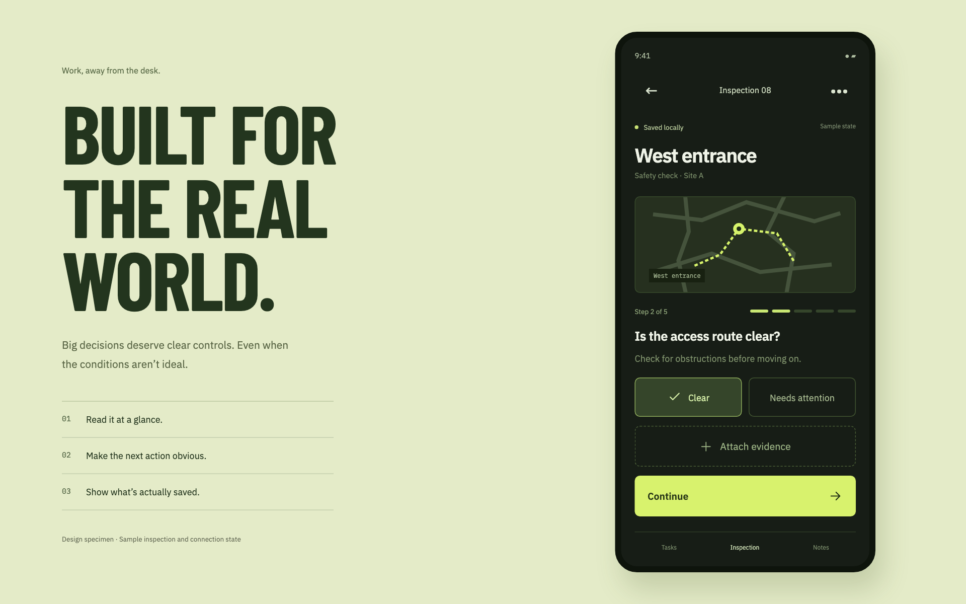
Use a dark, high-contrast task surface with a bright lime action and large decision targets. The specimen uses condensed display type for the surrounding direction, a sturdy sans-serif for actual mobile controls, 18px base text, 54px main controls, and 8px corners. Location, connection state, evidence, and the next inspection question establish the hierarchy. Keep the map secondary to the task and make saved/syncing states factual.
Apply the system
Read the existing project design instructions and the actual target screen before editing. Treat tokens.css as a starting vocabulary; map it into existing semantic tokens rather than adding a competing theme. Follow the user’s chosen palette, platform, and framework when they differ from this example. Do not change business logic, authentication, navigation destinations, or data behavior merely to reproduce the preview.
Open preview.html to inspect the system’s composition and component relationships. The preview is a visual specimen with sample content, not a complete application. Adapt the relationships to the user’s real content rather than copying its sample records.
Verify the result
Inspect the real output at its intended size and at a narrow viewport where applicable. Check text wrapping, alignment, contrast, focus, hover, selected, disabled, loading, empty, and error states. Exercise the primary action and its return path. For slide files, inspect every exported page and preserve editability. Report what was changed and actually verified; do not claim a visual preview proves a working backend.
Dropdown controls
Use styled, accessible dropdown menus that belong to the chosen design system. Style the opened option list as well as the trigger; do not expose an OS-native select popup. Include a selection checkmark, hover/focus/disabled states, arrow-key navigation, typeahead, Escape/outside dismissal, and viewport-bounded positioning. Reuse the project’s accessible select primitive. Preserve labels, values, form validation, reset behavior, and change events. For a small fixed quantity, a labeled radio group or stepper can be clearer than a dropdown.