When this fits
Use this system for focused mobile utilities, personal productivity, and task-based companion apps. Treat the screen as a sequence of decisions rather than a compressed desktop page.
Composition
Give each screen one clear title, a primary task, and a predictable way back. Use bottom navigation only for stable top-level destinations. Put record-level actions inside the record screen. Avoid placing both a top tab bar and bottom navigation around a short view without a real hierarchy.
Typography
Use 16–17px body and input text, 13–14px supporting labels, and 28–34px main titles. Support system text scaling. Start with at least 44px touch targets and add separation around destructive or tightly grouped controls.
Components and meaning
Use native platform controls where they fit. In forms, choose the correct keyboard, preserve input after an error, and move the focused field above the keyboard. Account for top and bottom safe areas instead of using fixed offsets that happen to fit one device.
Interaction details
Use sheets for short contextual tasks and full screens for longer flows. Keep the cancel or back behavior explicit. Do not nest multiple sheets when a step-based screen is clearer. Loading should preserve the geometry of the content being fetched.
Responsive and output behavior
Define resting, pressed, focused, disabled, selected, loading, empty, and error states. Pair status color with a label. Keep a primary action reachable without covering scrollable content or the device gesture area.
Motion and difficult states
Use short native-feeling transitions and honor reduced motion. Verify small screens, larger text, keyboard visibility, back navigation, rotation where supported, and an interrupted network request.
Visual signature
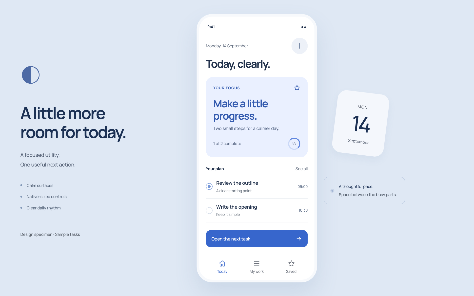
Use a bright phone surface, a prominent daily focus region, and native-feeling checklist rows. The specimen uses a rounded sans-serif, 17px base text, 46px controls, and 16px corners. Keep one main action reachable near the bottom of the content, with stable top-level navigation below it. Use a few useful tasks instead of shrinking a long list to fit the first screen.
Apply the system
Read the existing project design instructions and the actual target screen before editing. Treat tokens.css as a starting vocabulary; map it into existing semantic tokens rather than adding a competing theme. Follow the user’s chosen palette, platform, and framework when they differ from this example. Do not change business logic, authentication, navigation destinations, or data behavior merely to reproduce the preview.
Open preview.html to inspect the system’s composition and component relationships. The preview is a visual specimen with sample content, not a complete application. Adapt the relationships to the user’s real content rather than copying its sample records.
Verify the result
Inspect the real output at its intended size and at a narrow viewport where applicable. Check text wrapping, alignment, contrast, focus, hover, selected, disabled, loading, empty, and error states. Exercise the primary action and its return path. For slide files, inspect every exported page and preserve editability. Report what was changed and actually verified; do not claim a visual preview proves a working backend.
Dropdown controls
Use styled, accessible dropdown menus that belong to the chosen design system. Style the opened option list as well as the trigger; do not expose an OS-native select popup. Include a selection checkmark, hover/focus/disabled states, arrow-key navigation, typeahead, Escape/outside dismissal, and viewport-bounded positioning. Reuse the project’s accessible select primitive. Preserve labels, values, form validation, reset behavior, and change events. For a small fixed quantity, a labeled radio group or stepper can be clearer than a dropdown.