When this fits
Use this system for project work, document-heavy applications, case management, and collaboration. The visual priority is the current task and its supporting context. Avoid turning ordinary records into promotional tiles.
Composition
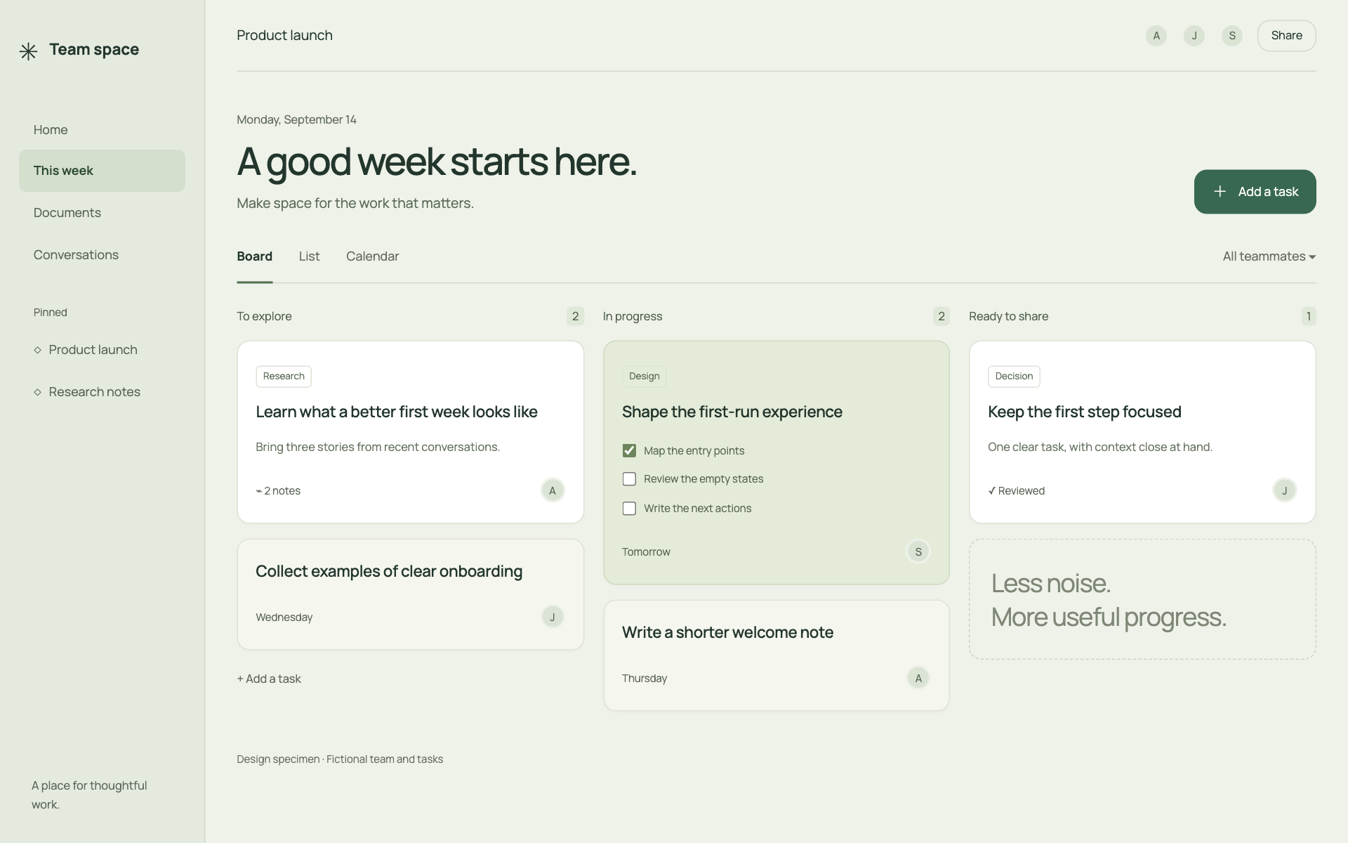
Use a two-region layout: persistent navigation and a readable workspace. Place optional context in a secondary panel that can close without losing work. Start with 48px record rows, generous form groups, and a content measure near 68 characters for prose.
Typography
Use 15–16px body and form text, 13px metadata, and 28–36px page titles. Prefer medium-weight headings and restrained letter spacing. Long labels wrap naturally; short IDs may stay on one line. Make the document title clearer than the application chrome.
Components and meaning
Group related fields with headings and whitespace, then use a divider only when groups would otherwise merge. Help text stays beside its field. Preserve submitted values after validation errors. Show saved, saving, and failed-to-save states as distinct messages based on real state.
Interaction details
Use one neutral surface layer for the workspace and one for an open panel. Avoid cards nested inside cards. Avatars identify people; they are not a reason to assign random accent colors. Selection and focus remain visible against both surfaces.
Responsive and output behavior
On mobile, make context a separate sheet or view with a visible return path. Keep the active record and any unsaved changes intact. Do not pin so many bars that the editable content loses its height.
Motion and difficult states
Use gentle 160–220ms panel transitions and little movement inside forms. Do not animate every item when returning to a list. Verify that long titles, empty records, loading states, and keyboard navigation remain quiet and readable.
Visual signature
Use an open sage-toned workspace with white and softly tinted task surfaces. Prefer a board or document canvas to a dense monitoring table. The specimen uses a rounded sans-serif, 15px base text, 42px controls, and 12px corners. Give cards enough padding to separate title, context, checklist, and owner. Keep low-priority text quiet but readable; do not make it faint to create calm.
Apply the system
Read the existing project design instructions and the actual target screen before editing. Treat tokens.css as a starting vocabulary; map it into existing semantic tokens rather than adding a competing theme. Follow the user’s chosen palette, platform, and framework when they differ from this example. Do not change business logic, authentication, navigation destinations, or data behavior merely to reproduce the preview.
Open preview.html to inspect the system’s composition and component relationships. The preview is a visual specimen with sample content, not a complete application. Adapt the relationships to the user’s real content rather than copying its sample records.
Verify the result
Inspect the real output at its intended size and at a narrow viewport where applicable. Check text wrapping, alignment, contrast, focus, hover, selected, disabled, loading, empty, and error states. Exercise the primary action and its return path. For slide files, inspect every exported page and preserve editability. Report what was changed and actually verified; do not claim a visual preview proves a working backend.
Dropdown controls
Use styled, accessible dropdown menus that belong to the chosen design system. Style the opened option list as well as the trigger; do not expose an OS-native select popup. Include a selection checkmark, hover/focus/disabled states, arrow-key navigation, typeahead, Escape/outside dismissal, and viewport-bounded positioning. Reuse the project’s accessible select primitive. Preserve labels, values, form validation, reset behavior, and change events. For a small fixed quantity, a labeled radio group or stepper can be clearer than a dropdown.