When this fits
Use this system for ledger-like workflows, inventory, approvals, and reconciliation. Its credibility comes from explicit labels and stable alignment. Financial-looking decoration does not substitute for clear data.
Composition
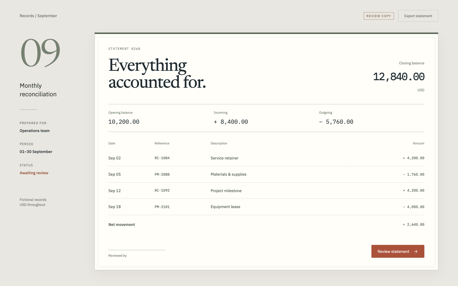
Organize the page around a record identity, its status, its totals, and its line items. Align numeric columns to the right and maintain a common decimal precision within each quantity type. Keep units and currency visible in headers or cells, and distinguish missing values from zero.
Typography
Use 14–16px interface text and 26–32px record headings. Apply tabular numbers to quantities and totals, but keep prose and labels in the body face. Totals may use a heavier weight; avoid making every value equally prominent.
Components and meaning
Use horizontal rules to separate summary, line items, and audit history. Prefer a flat table to individually boxed cells. Keep the record status near its identity and the approval action near the decision context. Existing permissions and validation remain authoritative.
Interaction details
Expose dates with enough context to distinguish creation, due, and posting dates. Preserve timezone and locale conventions from the app. For grouped totals, make the grouping and calculation basis visible. Do not infer a business rule from how a mockup looks.
Responsive and output behavior
On a small screen, show the record identity and decision first. Let line items scroll horizontally with clear column headings, or use labeled detail rows. Avoid hiding a total or approval warning below an unrelated visual.
Motion and difficult states
Use brief state transitions, persistent error messages, and stable scroll position after an edit. Test a long identifier, a negative value, an empty total, an unusually large number, and a permission-limited record before handoff.
Visual signature
Use a paper-like record surface and a margin rail for period, identity, and review state. Separate the formal record heading from the numeric system with a serif display face, a neutral sans-serif body, and dedicated monospace numerals. The specimen uses 14px base text, 36px desktop controls, and nearly square 2px corners. Numeric alignment, subtle rules, and explicit totals carry the identity; avoid dashboard-style cards for every field.
Apply the system
Read the existing project design instructions and the actual target screen before editing. Treat tokens.css as a starting vocabulary; map it into existing semantic tokens rather than adding a competing theme. Follow the user’s chosen palette, platform, and framework when they differ from this example. Do not change business logic, authentication, navigation destinations, or data behavior merely to reproduce the preview.
Open preview.html to inspect the system’s composition and component relationships. The preview is a visual specimen with sample content, not a complete application. Adapt the relationships to the user’s real content rather than copying its sample records.
Verify the result
Inspect the real output at its intended size and at a narrow viewport where applicable. Check text wrapping, alignment, contrast, focus, hover, selected, disabled, loading, empty, and error states. Exercise the primary action and its return path. For slide files, inspect every exported page and preserve editability. Report what was changed and actually verified; do not claim a visual preview proves a working backend.
Dropdown controls
Use styled, accessible dropdown menus that belong to the chosen design system. Style the opened option list as well as the trigger; do not expose an OS-native select popup. Include a selection checkmark, hover/focus/disabled states, arrow-key navigation, typeahead, Escape/outside dismissal, and viewport-bounded positioning. Reuse the project’s accessible select primitive. Preserve labels, values, form validation, reset behavior, and change events. For a small fixed quantity, a labeled radio group or stepper can be clearer than a dropdown.