When this fits
Use this system for monitoring, administration, triage, and tools opened many times a day. Choose a calmer system when the main task is extended reading. Keep navigation, workspace actions, and record actions on distinct rows.
Composition
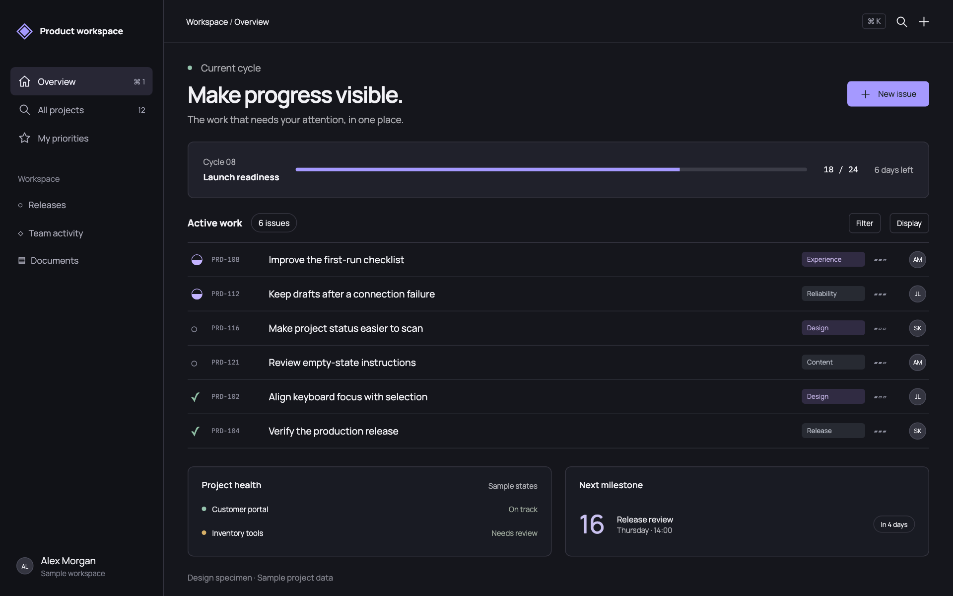
Anchor the workspace to a stable left rail. Reserve one page-level primary action and put search and filters beside the dataset they affect. Use tables for repeated comparable records; a card for every record makes scanning slower. Start at 40px rows and offer a comfortable density when records need two lines.
Typography
Use 14px interface text, 12px supplementary metadata, and 24–32px page headings. Keep labels in sentence case. Use tabular numbers for counts and dates, and monospace only for identifiers, logs, or code. Limit typography to three simultaneous sizes within a toolbar region.
Components and meaning
Show selected, keyboard-focused, hovered, pending, and disabled states separately. A selected row needs a persistent edge or background; hover alone is not selection. Keep destructive record actions in their existing confirmation flow. Errors belong beside the failed action with a usable retry path.
Interaction details
At narrow widths, collapse navigation before reducing text. Prioritize identifying columns; move secondary fields into an expandable detail area or a clearly scrollable table. Do not compress a desktop table into unreadably narrow columns. Preserve sort, selection, and filter state across the change.
Responsive and output behavior
Keep charts restrained: one emphasis series, labeled units, readable axes, and direct descriptions of status. Use color for a meaningful state and pair it with text or an icon. Avoid invented health scores and decorative live activity.
Motion and difficult states
Keep transitions around 120–180ms for menus and selection. Preserve spatial position when data refreshes. A loading state should keep the previous column geometry so the page does not jump. Reduced motion should leave the full interface usable.
Visual signature
Use a dark layered work surface, a persistent command rail, compact issue rows, and a narrow hierarchy between page actions and record metadata. The specimen uses a cool lavender emphasis, a sans-serif display/body family, 13px base text, 34px desktop controls, and 5px control corners. Keep row labels readable; reduce secondary columns before reducing their type. For touch input, increase the hit area rather than preserving desktop control density.
Apply the system
Read the existing project design instructions and the actual target screen before editing. Treat tokens.css as a starting vocabulary; map it into existing semantic tokens rather than adding a competing theme. Follow the user’s chosen palette, platform, and framework when they differ from this example. Do not change business logic, authentication, navigation destinations, or data behavior merely to reproduce the preview.
Open preview.html to inspect the system’s composition and component relationships. The preview is a visual specimen with sample content, not a complete application. Adapt the relationships to the user’s real content rather than copying its sample records.
Verify the result
Inspect the real output at its intended size and at a narrow viewport where applicable. Check text wrapping, alignment, contrast, focus, hover, selected, disabled, loading, empty, and error states. Exercise the primary action and its return path. For slide files, inspect every exported page and preserve editability. Report what was changed and actually verified; do not claim a visual preview proves a working backend.
Dropdown controls
Use styled, accessible dropdown menus that belong to the chosen design system. Style the opened option list as well as the trigger; do not expose an OS-native select popup. Include a selection checkmark, hover/focus/disabled states, arrow-key navigation, typeahead, Escape/outside dismissal, and viewport-bounded positioning. Reuse the project’s accessible select primitive. Preserve labels, values, form validation, reset behavior, and change events. For a small fixed quantity, a labeled radio group or stepper can be clearer than a dropdown.