When this fits
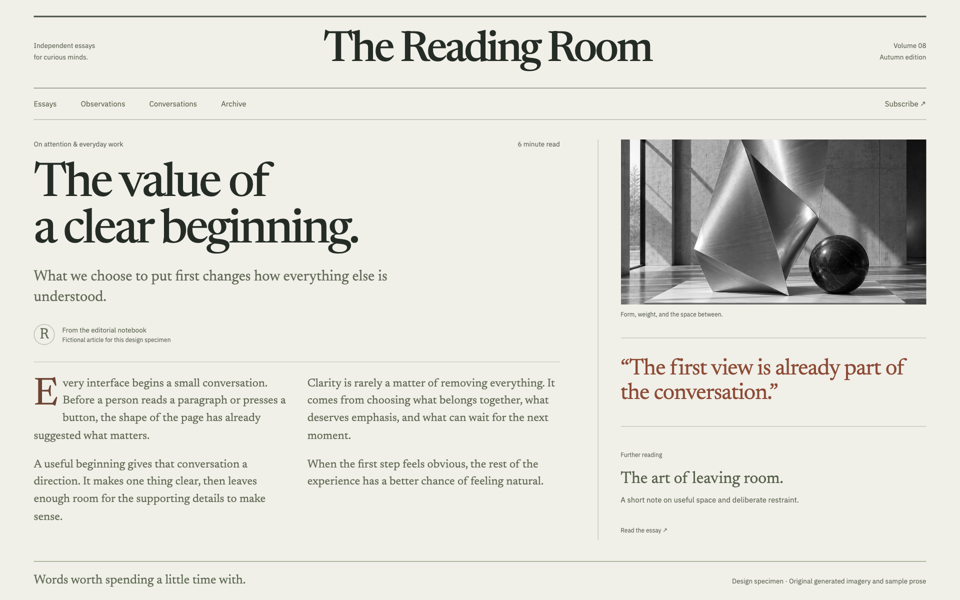
Use this system for essays, knowledge bases, journals, and explanatory publications. The reading experience is the primary interface, including navigation within a long document.
Composition
Establish title, summary, author attribution when known, and publication context before the article. Use a main reading column and an optional quiet contents rail. Do not add invented author biographies, reading statistics, or dates to make a page look established.
Typography
Use 42–64px titles and 18–21px body text with a 1.55–1.75 line height. Keep the reading measure around 60–72 characters. Use a clear heading sequence, comfortable paragraph spacing, and links that remain recognizable inside prose.
Components and meaning
Use a warm neutral background, dark text, and one link accent. Footnotes, captions, and pull quotes should support the argument without interrupting every paragraph. A pull quote must be an actual quotation from the article or an attributed source.
Interaction details
Choose illustrations and tables that explain something the text alone does not. Preserve captions, units, and source links. Wide tables or code should scroll within their own region instead of widening the entire page.
Responsive and output behavior
On small screens, move the contents list into a compact disclosure or a short list before the article. Keep the text size readable and preserve anchor navigation. Sticky headers must not cover the heading a link scrolls to.
Motion and difficult states
Use minimal motion. Verify a long article, nested headings, footnotes, code, quotations, and a missing image. Check exported or print views when requested, and ensure that the article remains useful without decorative media.
Visual signature
Use a strong publication masthead, a readable article measure, a distinct deck/summary treatment, and optional marginal imagery or notes. The specimen pairs a reading serif with a sober sans-serif for navigation and metadata, uses 19px base text, 42px controls where needed, and square framing. Collapse article columns into one reading column on a phone. Keep this system recognizably different from the image-led portfolio and the expressive editorial landing page.
Apply the system
Read the existing project design instructions and the actual target screen before editing. Treat tokens.css as a starting vocabulary; map it into existing semantic tokens rather than adding a competing theme. Follow the user’s chosen palette, platform, and framework when they differ from this example. Do not change business logic, authentication, navigation destinations, or data behavior merely to reproduce the preview.
Open preview.html to inspect the system’s composition and component relationships. The preview is a visual specimen with sample content, not a complete application. Adapt the relationships to the user’s real content rather than copying its sample records.
Verify the result
Inspect the real output at its intended size and at a narrow viewport where applicable. Check text wrapping, alignment, contrast, focus, hover, selected, disabled, loading, empty, and error states. Exercise the primary action and its return path. For slide files, inspect every exported page and preserve editability. Report what was changed and actually verified; do not claim a visual preview proves a working backend.
Dropdown controls
Use styled, accessible dropdown menus that belong to the chosen design system. Style the opened option list as well as the trigger; do not expose an OS-native select popup. Include a selection checkmark, hover/focus/disabled states, arrow-key navigation, typeahead, Escape/outside dismissal, and viewport-bounded positioning. Reuse the project’s accessible select primitive. Preserve labels, values, form validation, reset behavior, and change events. For a small fixed quantity, a labeled radio group or stepper can be clearer than a dropdown.