When this fits
Use this system for thoughtful services, independent publishing, cultural projects, and explanatory websites. Let the writing and imagery set the pace. It is a poor fit for a dense operational console.
Composition
Build a clear reading sequence: a specific headline, supporting copy, one primary action, and a credible image or example. Use asymmetric columns when one side has a clear supporting role. Maintain a common left edge between navigation and main content.
Typography
Use a serif display face for 48–76px desktop headlines and a neutral sans-serif body at 17–19px. On phones, reduce the headline to 36–44px before forcing awkward word breaks. Keep prose near 55–68 characters per line. Use a small number of heading sizes and avoid ornamental overlines.
Components and meaning
Use warm paper and dark ink as the main contrast. The muted accent belongs to links, selection, or one important action. Give photography a consistent treatment through aspect ratio and subject choice; do not apply a filter merely to make unrelated images match.
Interaction details
Prefer a divider and whitespace over a card for ordinary sections. Reserve contained panels for quotations, comparisons, or a concrete example. Buttons should have readable labels and modest corners. Link text should explain the destination.
Responsive and output behavior
On mobile, bring the supporting image after the proposition and action. Preserve the meaning of captions. Avoid a hero so tall that the primary action is absent from the initial screen. Text wrapping should look deliberate at intermediate widths too.
Motion and difficult states
Use restrained reveals only when they clarify reading order. The first meaningful content should be visible without an animation completing. Keep all content present for reduced motion and validate long-form readability, focus visibility, and actual image loading.
Visual signature
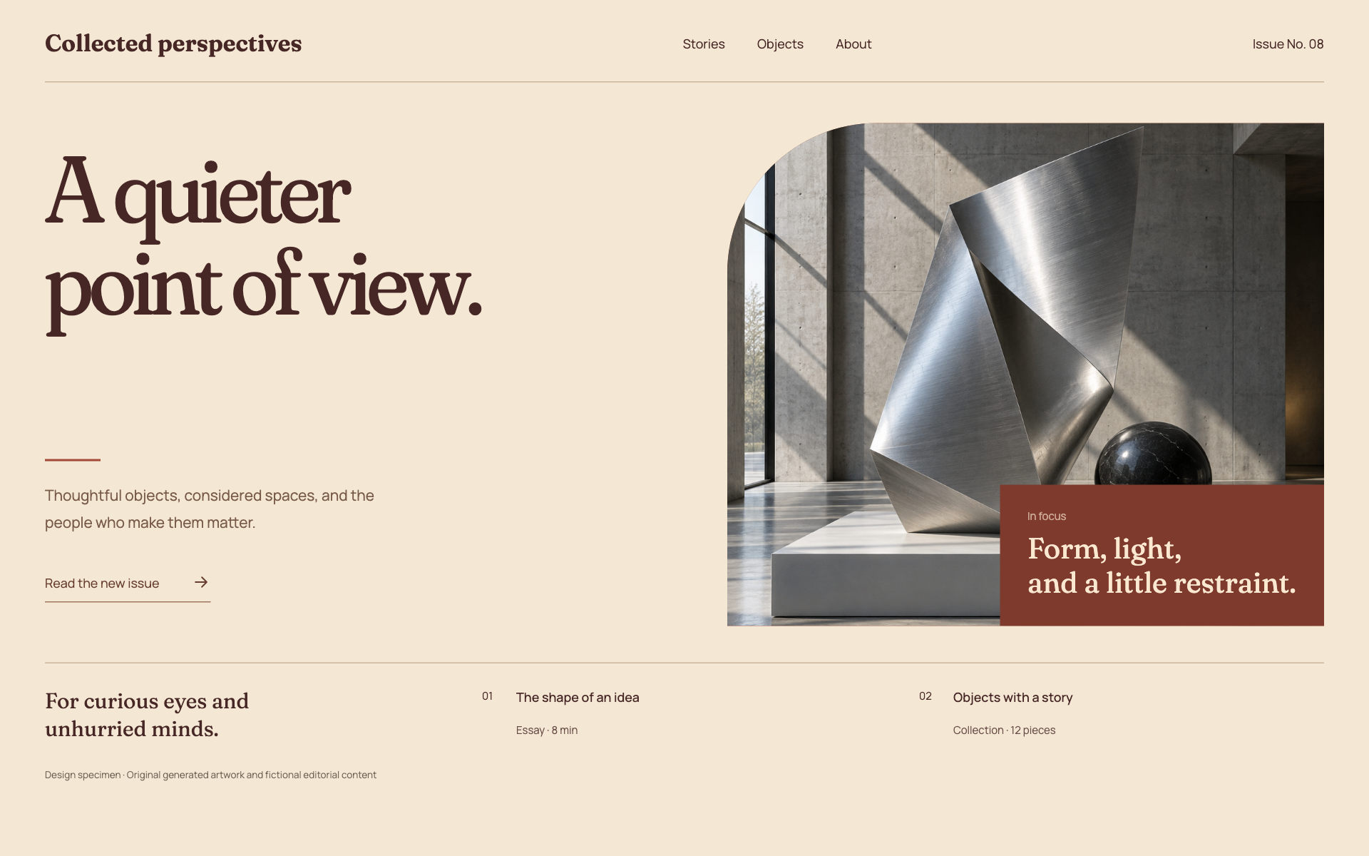
Use a warm editorial spread, an expressive variable serif, uneven columns, and a deliberately cropped image region. The specimen pairs large serif headings with an 18px sans-serif body, 46px actions, and mostly square control edges. Give the artwork its own composition and connect it to the text with a caption. Do not reproduce the gallery system’s dark image-first rail or the journal system’s multi-column reading layout.
Apply the system
Read the existing project design instructions and the actual target screen before editing. Treat tokens.css as a starting vocabulary; map it into existing semantic tokens rather than adding a competing theme. Follow the user’s chosen palette, platform, and framework when they differ from this example. Do not change business logic, authentication, navigation destinations, or data behavior merely to reproduce the preview.
Open preview.html to inspect the system’s composition and component relationships. The preview is a visual specimen with sample content, not a complete application. Adapt the relationships to the user’s real content rather than copying its sample records.
Verify the result
Inspect the real output at its intended size and at a narrow viewport where applicable. Check text wrapping, alignment, contrast, focus, hover, selected, disabled, loading, empty, and error states. Exercise the primary action and its return path. For slide files, inspect every exported page and preserve editability. Report what was changed and actually verified; do not claim a visual preview proves a working backend.
Dropdown controls
Use styled, accessible dropdown menus that belong to the chosen design system. Style the opened option list as well as the trigger; do not expose an OS-native select popup. Include a selection checkmark, hover/focus/disabled states, arrow-key navigation, typeahead, Escape/outside dismissal, and viewport-bounded positioning. Reuse the project’s accessible select primitive. Preserve labels, values, form validation, reset behavior, and change events. For a small fixed quantity, a labeled radio group or stepper can be clearer than a dropdown.