When this fits
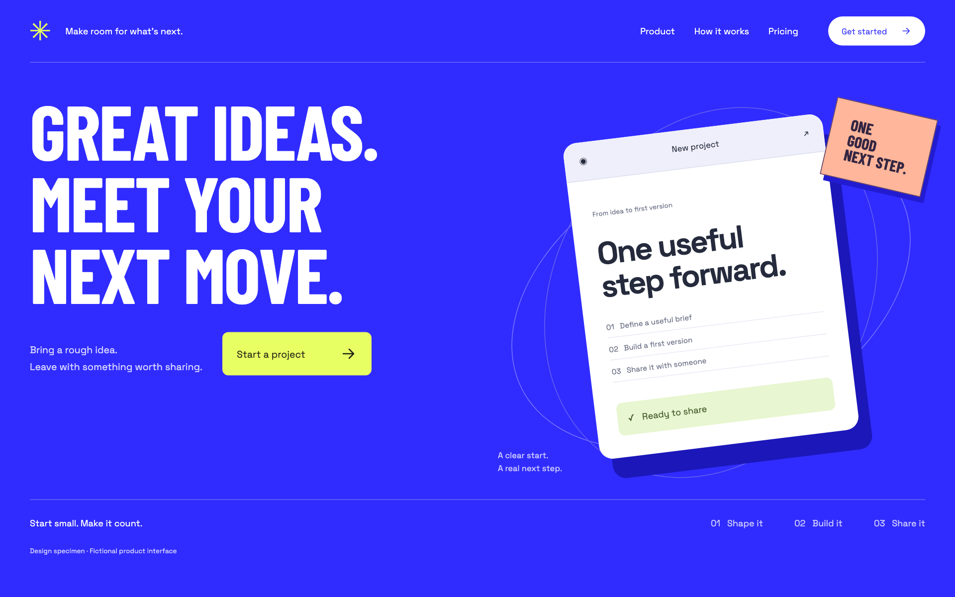
Use this system when a product has one strong proposition and a concrete action. The energy comes from scale, contrast, and evidence. A vague message will not improve when set in larger type.
Composition
Open with a short, specific headline and a direct primary CTA. Support it with a real product view or a useful demonstration. Build the rest of the page around what a person can accomplish, what they need to start, and what happens next.
Typography
Use 64–88px desktop display text at medium or semibold weight, with a tight but legible line height. Keep the hero to a few intentional lines at each breakpoint. Use 17–19px body copy and 14–16px controls. Avoid a new type treatment for every section.
Components and meaning
Use the saturated accent at deliberate focal points: primary actions, a key state, or a single large section. Balance it with broad neutral space. Keep foreground contrast readable inside colored surfaces. Do not rely on gradients to supply the identity.
Interaction details
Build a visibly dominant action and a quieter secondary path. A CTA must lead to a useful next state rather than a repeated version of the content already visible. Proof should be a real example, an explained capability, or a verified claim; do not invent customer logos or statistics.
Responsive and output behavior
On mobile, keep the proposition and first action visible before a large media block. Recompose overlapping layouts into an ordered stack. If a video is used, supply an informative poster and explicit controls, and keep the encoded result sharp at the intended display density.
Motion and difficult states
Use short, purposeful motion to demonstrate a transition or feature. Avoid perpetual decorative movement. Keep layout stable while media loads and verify the complete CTA flow, including returning from authentication.
Visual signature
Use a saturated canvas, oversized condensed display type, a sharp light-on-color hierarchy, and a high-contrast primary action. The specimen uses 18px body text, 48px actions, and 6px corners. A product visual can overlap its supporting graphics, but the proposition and CTA stay on clean rails. Keep labels meaningful and avoid skeleton text or empty decorative product windows in the finished output.
Apply the system
Read the existing project design instructions and the actual target screen before editing. Treat tokens.css as a starting vocabulary; map it into existing semantic tokens rather than adding a competing theme. Follow the user’s chosen palette, platform, and framework when they differ from this example. Do not change business logic, authentication, navigation destinations, or data behavior merely to reproduce the preview.
Open preview.html to inspect the system’s composition and component relationships. The preview is a visual specimen with sample content, not a complete application. Adapt the relationships to the user’s real content rather than copying its sample records.
Verify the result
Inspect the real output at its intended size and at a narrow viewport where applicable. Check text wrapping, alignment, contrast, focus, hover, selected, disabled, loading, empty, and error states. Exercise the primary action and its return path. For slide files, inspect every exported page and preserve editability. Report what was changed and actually verified; do not claim a visual preview proves a working backend.
Dropdown controls
Use styled, accessible dropdown menus that belong to the chosen design system. Style the opened option list as well as the trigger; do not expose an OS-native select popup. Include a selection checkmark, hover/focus/disabled states, arrow-key navigation, typeahead, Escape/outside dismissal, and viewport-bounded positioning. Reuse the project’s accessible select primitive. Preserve labels, values, form validation, reset behavior, and change events. For a small fixed quantity, a labeled radio group or stepper can be clearer than a dropdown.