When this fits
Use this system for considered retail, food, craft, home, and product-led stores. Visual warmth should help a person evaluate the product and its purchase conditions.
Composition
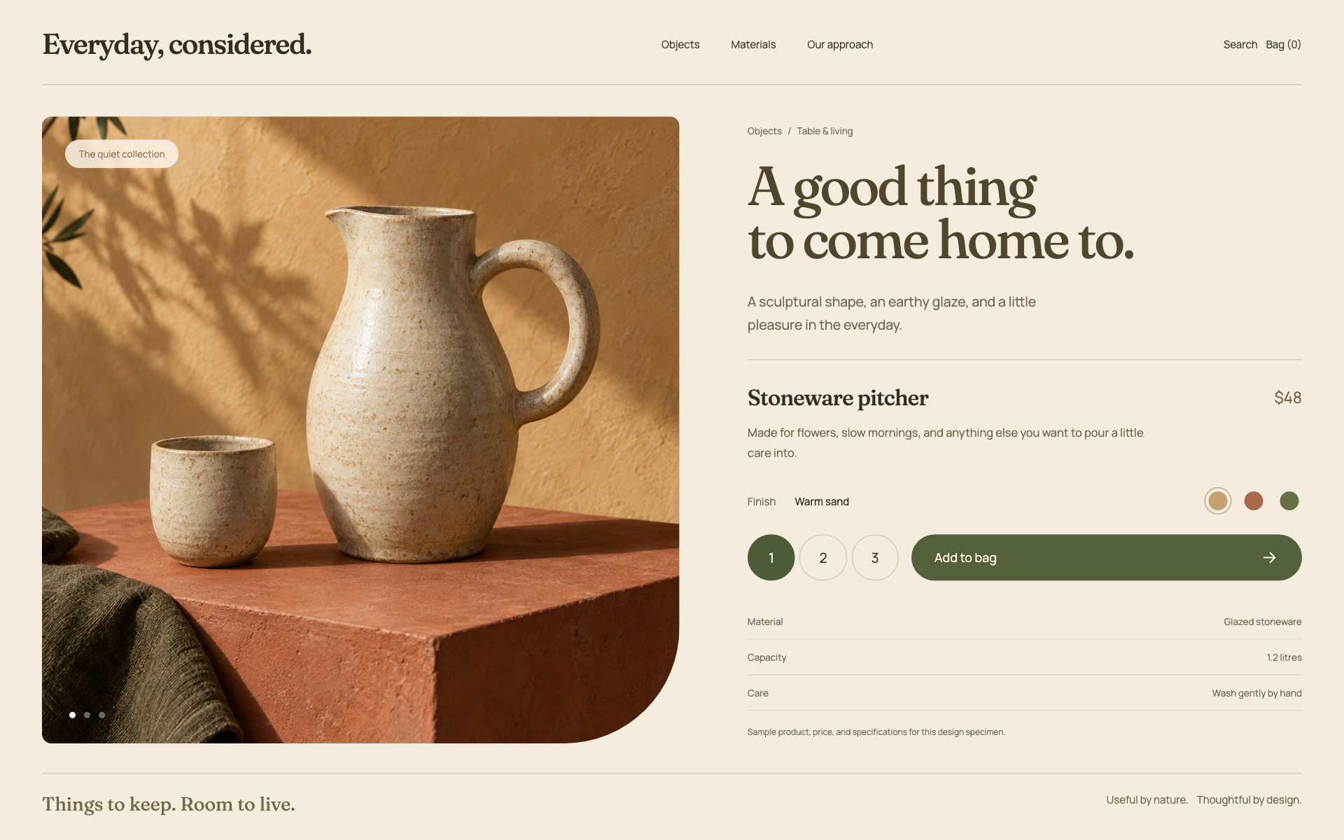
Give the product image, name, price, availability, and primary purchase action a clear hierarchy. Keep variant selection and quantity near the action. Shipping, return, and fulfillment details belong where they affect the decision, not only in a remote footer.
Typography
Use a serif display face for editorial headings at 44–64px and a neutral sans-serif for commerce details at 15–17px. Prices and totals must be easy to compare. Avoid decorative type for quantities, size labels, or validation errors.
Components and meaning
Use warm neutral surfaces and one earthy action color. Product photography should share a deliberate crop and lighting treatment where assets allow it. Do not invent product shots, reviews, badges, or inventory claims without marking sample content appropriately.
Interaction details
Keep product cards simple: image, title, price, and one useful detail. Do not hide the only purchase action behind hover. Cart line items need clear quantities, prices, removal controls, and recalculated totals based on real state.
Responsive and output behavior
On mobile, preserve product-image quality and readable variant controls. A sticky purchase bar may summarize the decision but must not cover important terms or the last option. Keep keyboard and focus order coherent through cart and checkout states.
Motion and difficult states
Use modest image transitions and direct feedback for a successful cart update. Test sold-out variants, long names, loading prices, empty carts, validation errors, and interrupted checkout. The design must not imply that payment or order storage is implemented when it is not.
Visual signature
Use tactile product photography beside a precise purchase panel, with earthy color, an expressive serif heading, and a neutral body face. The specimen uses 17px base text, 48px purchase actions, and soft 24px corners for controls. The product image and buying decision share the visual weight. Keep variant choice, quantity, price, and product facts together; do not turn the page into an editorial gallery with no usable purchase hierarchy.
Apply the system
Read the existing project design instructions and the actual target screen before editing. Treat tokens.css as a starting vocabulary; map it into existing semantic tokens rather than adding a competing theme. Follow the user’s chosen palette, platform, and framework when they differ from this example. Do not change business logic, authentication, navigation destinations, or data behavior merely to reproduce the preview.
Open preview.html to inspect the system’s composition and component relationships. The preview is a visual specimen with sample content, not a complete application. Adapt the relationships to the user’s real content rather than copying its sample records.
Verify the result
Inspect the real output at its intended size and at a narrow viewport where applicable. Check text wrapping, alignment, contrast, focus, hover, selected, disabled, loading, empty, and error states. Exercise the primary action and its return path. For slide files, inspect every exported page and preserve editability. Report what was changed and actually verified; do not claim a visual preview proves a working backend.
Dropdown controls
Use styled, accessible dropdown menus that belong to the chosen design system. Style the opened option list as well as the trigger; do not expose an OS-native select popup. Include a selection checkmark, hover/focus/disabled states, arrow-key navigation, typeahead, Escape/outside dismissal, and viewport-bounded positioning. Reuse the project’s accessible select primitive. Preserve labels, values, form validation, reset behavior, and change events. For a small fixed quantity, a labeled radio group or stepper can be clearer than a dropdown.